
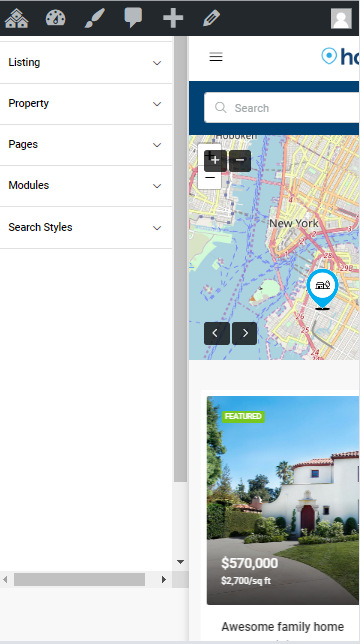
The menu assigned to the Main Menu location will be also displayed as Mobile Menu. The mobile menu is available on the top left corner of your page when you navigate the website with a tablet or a smartphone.
Styling mobile menu colors
To customize the mobile menu colors navigate to Theme Options > Styling > Mobile Menu
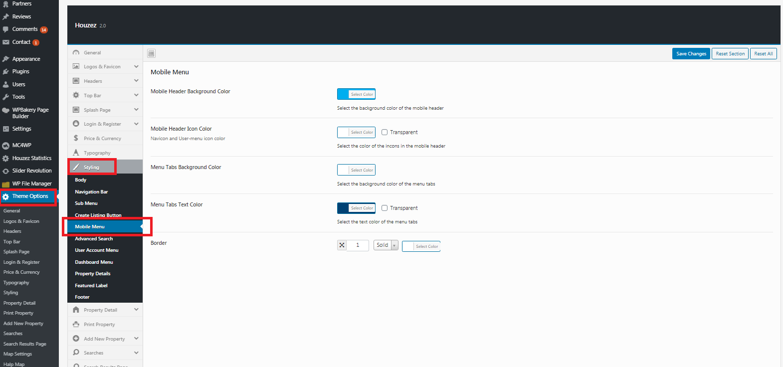
- Mobile Header Background Color: Pick a background color (or Transparent)
- Mobile Header Icon Color: Navicon and User-menu icon color
- Menu Tabs Background Color: Select Color
- Menu Tabs Text Color: Select Color (or Transparent)
- Border: customize mobile navigation borderline
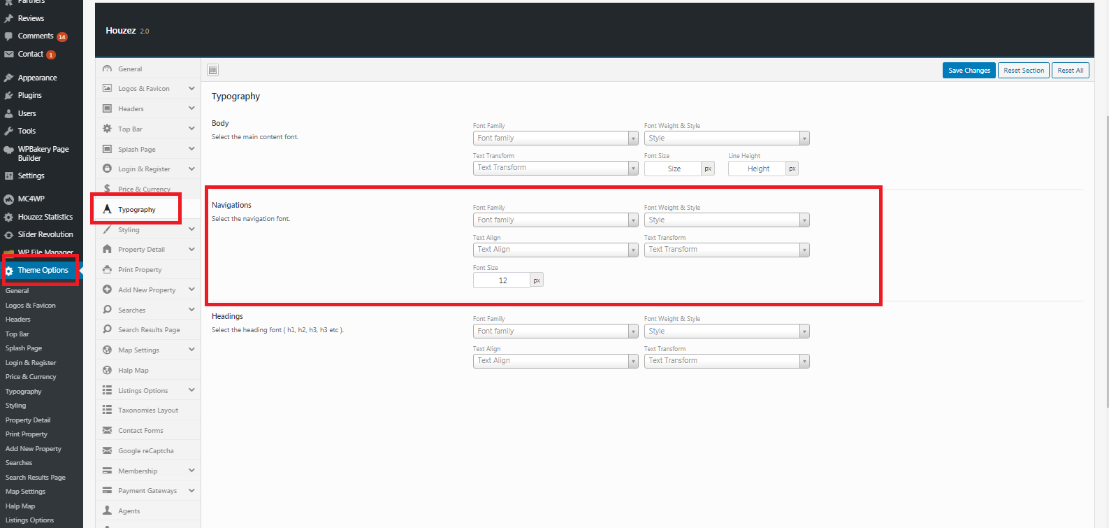
Navigation Typography
To customize the navigation typography Navigate to Theme Options > Typography and use the font options available in the Navigation box.
Comments
1 comment
Currently, the main menu for mobile devices is always on the left side. Please add support for this menu to be placed on the right side of the header.
Thank you!
Please sign in to leave a comment.